Marketing tools
Assets
You’ll find brand assets like screenshots, logos, and illustrations in the Loomio brand assets folder. Please keep these organised so we can quickly produce new marketing collateral - talk to Rich if you have questions.
Image files are named descriptively, including the width in pixels, like loomio-mobile-content_394.png
Link tracking
To start with at least, we're going to be very granular with our link tracking. This article is a good introduction to UTM link tracking. This is the spreadsheet for building our UTM links:

The first page is the content distribution link generator. So when we have a new blog post, we'll use a unique link to share it on Facebook, and another one on Twitter.
The second page is the internal link generator. So the call to action at the bottom of the blog post will have this link on it.
This way we can run a single campaign across lots of different channels and see how they perform relative to each other.
In Google Analytics, go to Acquisition -> Campaigns -> All Campaigns to see how all the campaigns are performing.
Unbounce for landing pages
We’re using Unbounce.com to build and test landing pages. A landing page is a single page that has all the information someone needs to make a purchase. It is targeted at a specific user with a specific problem.
If you skip 15 minutes into this podcast you’ll get a great summary of the 5 critical elements of a successful landing page:
- Specific and unique value proposition
- Hero shot (photo or video showing the solution) relevant, contextualised, emotion, credible, persuasive
- Feature benefits (couple sentences + couple bullets first, possibly more comprehensive feature details later)
- Social proof (testimonials w/ very specific quotes)
- Call to action (CTA)
CTAs link to "https://www.loomio.org/start_group" with the “Pass through URL parameters” option selected. This means we can put UTM's on our Facebook ad like get.loomio.org/governance?utm_campaign=governance&utm_source=facebook, and then the button on the landing page will link to https://www.loomio.org/start_group?utm_campaign=governance&utm_source=facebook
Screenshots
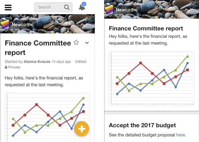
Our landing pages feature screenshots of the app in use. To convey the meaning more succinctly, we remove extra UI elements, like the navbar and options menus. Like this:

Screenshots before and after removing extra UI
If you install the Stylish extension on Chrome or Firefox, you can then run this custom stylesheet to remove this extra UI.
If you open the Developer Tools in either of those browsers (opt+cmd+I), in Responsive Design Mode (cmd+shift+M in Chrome, cmd+opt+M in Firefox) you can configure the screen to a standard 320x480px size, so all your screenshots are the same size.
Many of us have a Retina screen, which has twice the pixel density of the a standard screen. This creates a lot of confusion. The Responsive Design screen tells you you’re looking at a 320px-wide screen, but if you’re on a Retina screen, there are actually 640 pixels there.
If you’re on a Retina Mac, OSX and Chrome’s built-in screenshot tools will both produce a 640px image, whereas Firefox’s screenshotter will make a 320px image.
If we use 640px images, we can be sure they’ll look good on Retina Macs, iPhones, iPads, and other high def screens.
Screenshots live in the landing page screenshots folder in the Drive.